Secretly Beautiful: Excel
A designer shows you what the world’s #1 spreadsheet tool is truly capable of.
You have probably used Excel at some point in your life. Unfortunately it was probably not being used for something enjoyable. Maybe you were keeping track of expenses or struggling through some convoluted task at work.

Well I’m here to tell you that Excel can be so much more.
This is how I use it in a way that’s both fun and beautiful.
That’s right I said ‘fun’ and ‘beautiful’. Seems like a paradox. How could that boring set of tables be anything other than painful to work with?
It all comes down to a powerful set of visual design features that are overlooked by the vast majority of users.
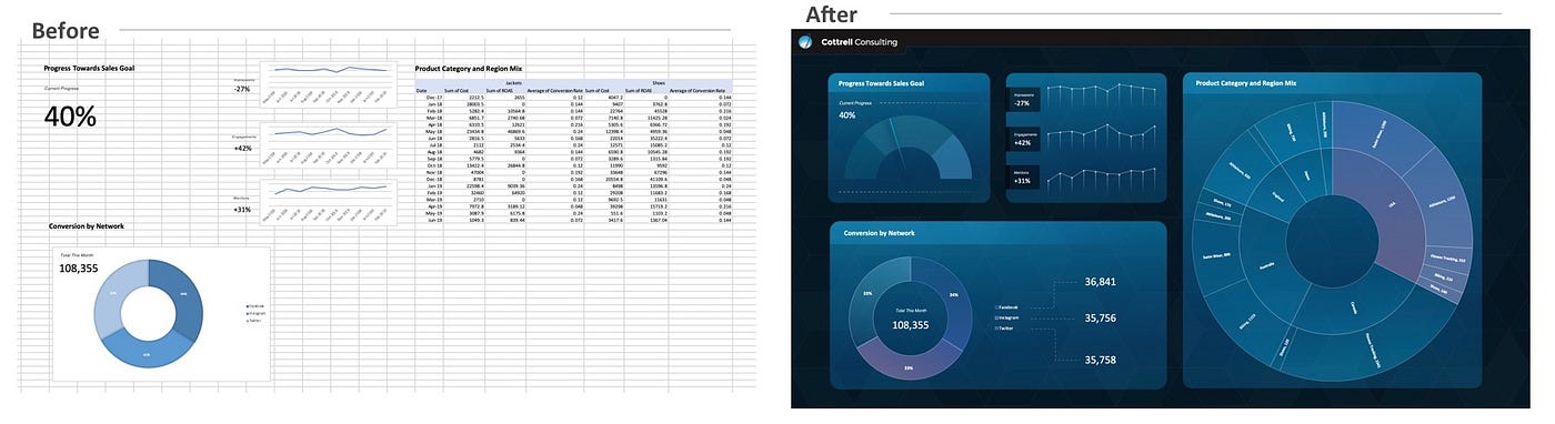
“So…” you ask, “my Excel sheets are pretty boring. How can I do this too?” The answer is simple. Start playing with every feature under the “Insert” tab:

Shapes, pictures, icons and chart formatting are the keys to making it work. In fact, almost every design feature you typically use in PowerPoint is available right here in Excel.

Here are a handful of features I used in these dashboards that you can easily learn:
- Setting a background image
- Including cell values in a text object or shape
- Understanding shape features like gradients, transparency, outlines, shadows, etc.
- Customizing chart colors

Of course making the most out of these design features requires some design chops.
When you start taking your data out of a table and turning it into charts and scorecards, it’s important to be thinking about some core functions:
First choose a color palette and stick to it! There are jillions of free palette tools online or you can use the default options already built into the color menu in Excel.
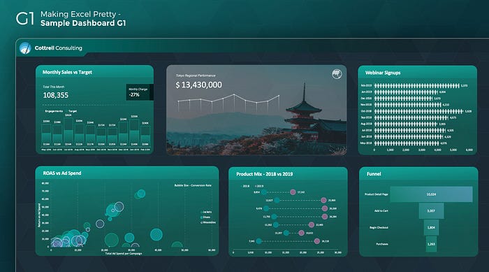
Second use the AAE method: Always Align Everything. That means your charts should be the same height, aligned on the top and left hand sides to nearby objects, ideally using a grid (see image below).
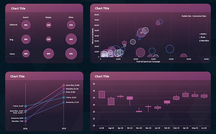
Third transparency and gradients are your friends! If you use a light red color for your outline, use the same color for your shape fill but drop the transparency to right around 80%. It makes things feel cohesive. Also don’t be afraid of gradients, they can look great if you treat them with respect. My advice is find a design you like and try to copy their gradients using the color picker tool on your laptop (if you don’t know what that is, then google it!). You can start by copying the gradients in these dashboards!
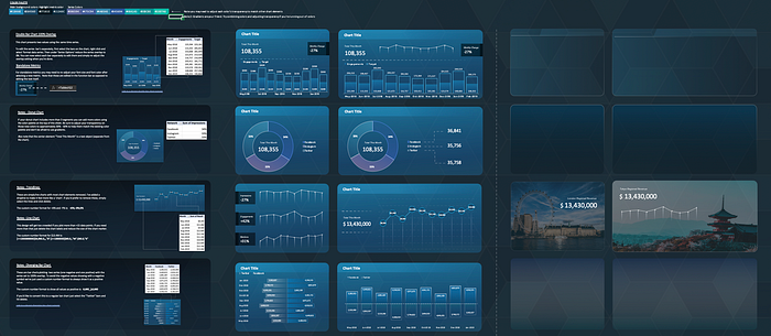
Last but not least you’re more than welcome to get a head start by using a pre-built template.
I have a toolkit you can see by clicking here. It covers basic instructions for using my favorite charts, various palettes and shape designs, along with plenty of extras. Here’s a little snapshot of one of the color palettes it includes:
So what will you do to make your Excel sheets more interesting? Do you think you’ll start using more of its design features?
