How to make Excel look less like… Excel
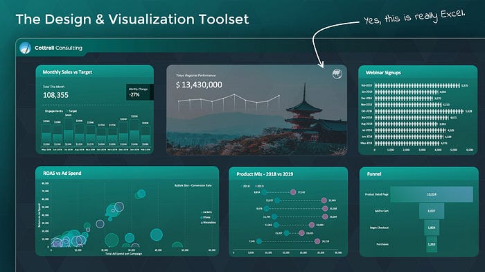
Excel — we’ve all used it, some people love it, and most people enjoy it about as much as filing their taxes. It can feel like a painfully boring piece of software. But I’m here to say that it doesn’t have to be.
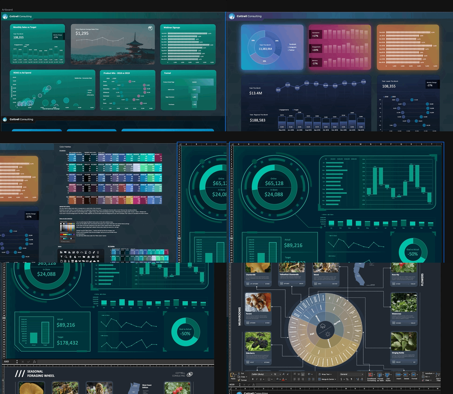
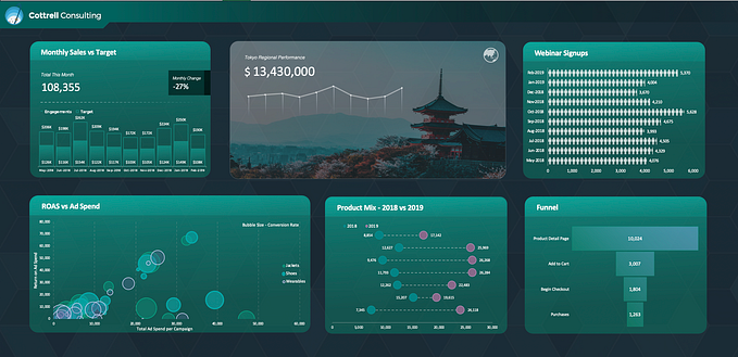
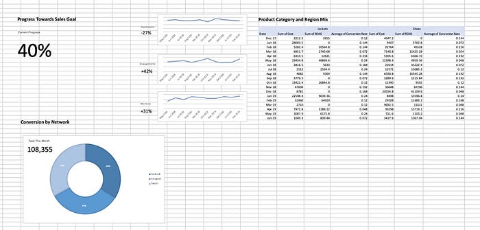
With a bit of finagling and some basic knowledge of Excel’s design features, you can take your dashboard from this:
To this:
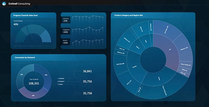
The underlying concepts are surprisingly simple, once you realize that you can do almost anything in Excel that you can do in Powerpoint. So let’s break down how to make your workbooks a bit more snazzy:
- You’re not limited to formatting cells
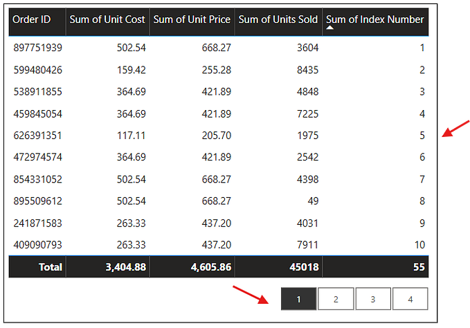
Excel is more than just rows and columns of cells. You can insert shapes, images, charts, text and more. This is the single most important concept to understand before you can leverage all the most powerful design features in Excel. When you limit yourself to formatting cells on a sheet, everything you build has the same boxy look and feel. Like this:

This leads us into our next concept, which is the most important way to break yourself out of a tabular box:
2. Shapes are your best friend
Just like building a powerpoint (or even an HTML site) you start by laying out the underlying shapes that will make the foundation of your design. Excel has a wide range of shape options with a lot of room for customization.

Shapes don’t just need to be a single color. You can fill them with a gradient, you can fill them with an image, you can make them transparent, or even fill them with a pattern.
To illustrate: these are all different versions of a “rectangle” in Excel

Shapes also enable us to freely place metrics/values on our page (outside of a cell). You can do this by using a fully transparent shape with no background and adding text to it. The text will show up but the shape won’t. This allows you to place text on the screen outside the cell grids on Excel.

3. Any design element that can’t be made using Excel’s shapes can be imported as an image
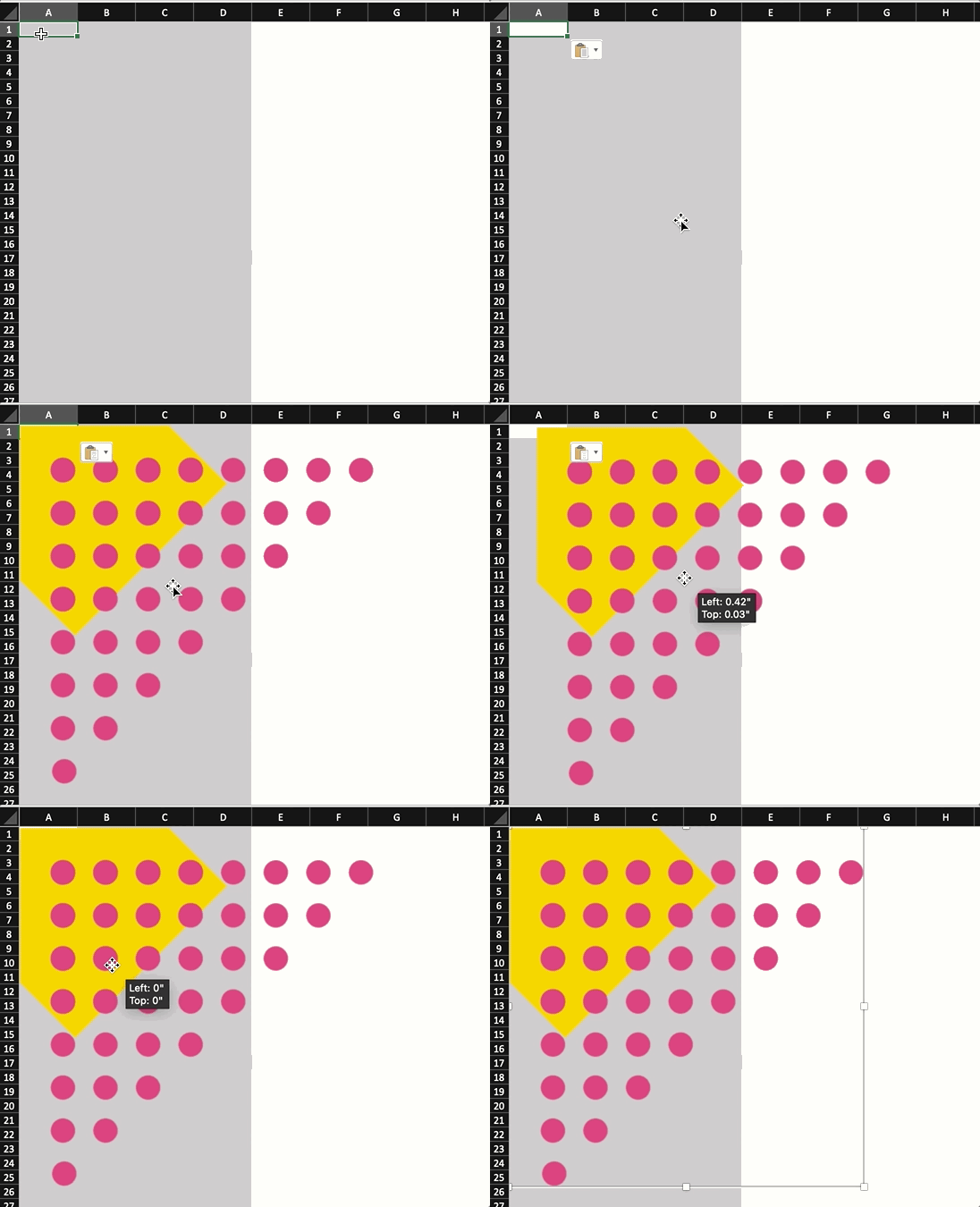
PNG, SVG and GIF files have transparent backgrounds. This means that you can create complex design elements in a vector or image editor, export them in a PNG/SVG/GIF format, and add them in Excel.
For example, if I want some cool organic shapes on my dashboard I can make the shape in photoshop and then paste it right into Excel
4. Keep it organized!
I start with a card layout in a grid pattern. Essentially block out each section using a series of rectangles with equal spacing.
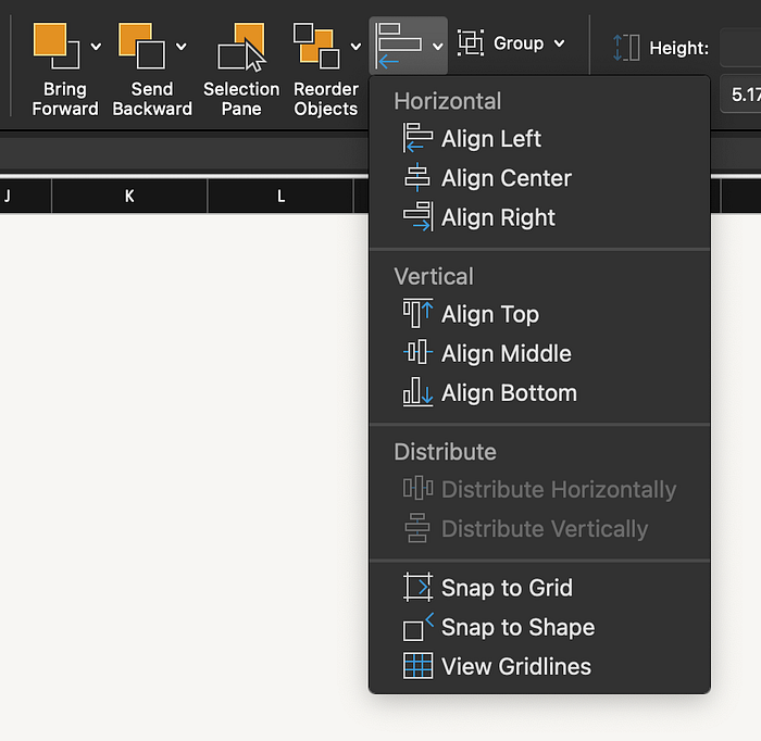
The basic idea here is a principle that I call AAE (Always Align Everything). Try to maintain similar widths and lengths to related sections. Make sure you always use the distribution and alignment tools (found under the ‘Shape Format’ tab).
5. Never use the default color palette
Excel has a very recognizable set of default colors and when you use them your dashboard will look pretty similar to everything else made in Excel.

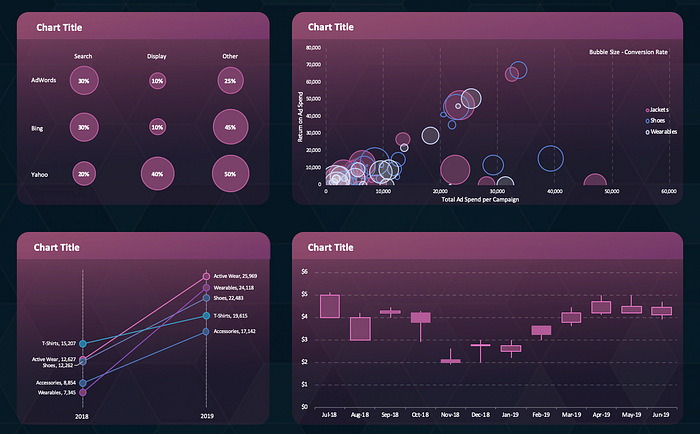
Choosing a different color palette can make a big impact and help you make your work stand out. I suggest two ways of doing this: the first is to simply use google image search and find an existing dashboard with colors you like and use those. Obviously don’t make a carbon copy of another person’s work, but simply taking inspiration from their color scheme is totally acceptable. The second option is to use a color palette tool like the Adobe Color Wheel. It will take some practice but it’s an effective way to quickly generate a nice new set of colors.
6. Don’t do everything at once
The most common problem I see when people start designing a dashboard is including way too much information on one page.
Humans have a limited ability to process complex data. That means that we need to be very intentional about the data we put in front of the people using our dashboards. The easiest way to start is by thinking about the story you’re trying to tell with your data.
A giant table of data doesn’t necessarily tell a story. A page with 20+ different charts also doesn’t tell a story. You need to strategically pick out a series of metrics and charts that tells a story.
Here’s an example that I use in one of my Data Studio guides:
Data Hierarchy:
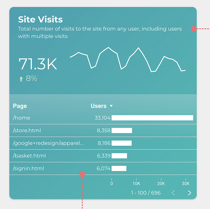
Almost all the scorecards that I create follow a fairly simple recipe. It’s based on the hierarchy of information a person needs to understand a piece of data. The concept is simple:
1) What is the metric name? Avoid confusing abbreviations or corporate jargon. Stick to clear titles.
2) How would you describe this metric to someone with no technical skills? You’ve got one sentence to help your viewer understand what this metric is and to add any important context they will need to understand it.
3) Show the metric. Make it big and format it properly. If it’s a metric that changes over time it can be worthwhile to include how much a metric has increased or decreased since the previous period.
4) If it’s a time series, then show the metric over time. This doesn’t necessarily mean you need anything complex, a simple trendline will do. The first thing the human mind wonders when seeing a metric is whether it’s higher or lower than usual. This quickly addresses that question.
Anticipating the Question:
One of the most critical skills you can develop when building a dashboard is to anticipate your audience’s next question.
Each situation is unique but I’ll explain with an example:
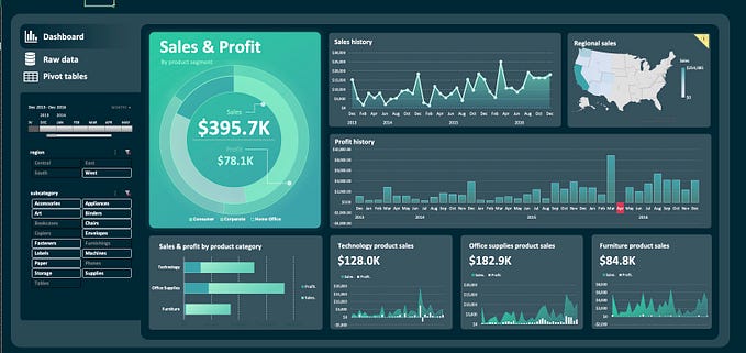
In this scorecard we’re showing site visits. We use a comparison period and trendline to show that more people are visiting than previous periods (which is great) but there’s an obvious next question…. where are they going on our site? Are they visiting our blog? Or maybe visiting our store? To answer these questions, I’ve included a table beneath the metric that shows how much traffic is going to each page of our site.
There are lots of other questions someone might ask. You’ll have to think about your own audience and what they care about every time you build something. The key takeaway is that it’s critically important to understand your audience and the kinds of questions they have before you start building.

Last but not least, I send out free sample Excel templates each month to the folks on my newsletter. No spam, no hard selling, just awesome .xlsx files.
You can join the newsletter here: http://eepurl.com/hZPvKr

