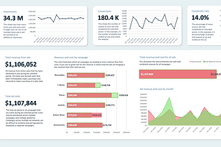
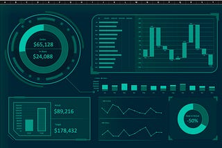
PinnedPublished inPrototyprThe 6 best free Google Data Studio templatesFor Adwords, Google Analytics, Paid Media and eCommerceAug 5, 20181Aug 5, 20181
Published inBootcampI bet you didn’t know that Excel could do thisA brief exploration into the outer limits of Excel’s functionalityNov 22, 202229Nov 22, 202229
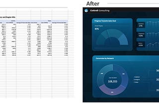
Why you should (probably) build your 1st dashboard in ExcelAlmost all dashboard projects can benefit from building a prototype in Excel — many should be built entirely in ExcelJun 27, 20223Jun 27, 20223
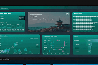
5 of my favorite Excel dashboard examplesIt’s easier than you think to build powerful dashboards in ExcelMay 31, 20221May 31, 20221
The Excel-to-PowerPoint ConnectionThe easiest way to automatically update data in your slide decksMay 30, 2022May 30, 2022
3 Excel features that barely anybody knows aboutHold on to your spreadsheets, I’m about to blow your mind!May 15, 20222May 15, 20222
The Excel+Design newsletter has launched on Product Hunt!Building out the newsletter has been a labor of love and I’ve finally had a chance to launch it to the world.May 10, 2022May 10, 2022
Inserting dynamic cell values into shapes & text boxes in Excel — A quick tutorialThe 1st step towards building dynamic dashboardsMay 6, 2022May 6, 2022
Spreadsheets in full colorThere’s no need for spreadsheets to be shades of grey, this is how you can design colorful spreadsheets that stand outApr 28, 2022Apr 28, 2022
Building a data viz newsletter that people actually want to openCan you go from Ø to 1000 true fans by giving away valuable template files for free?Apr 26, 2022Apr 26, 2022
Published inBootcampExcel is your most overlooked design toolA designer’s perspective on the world’s #1 spreadsheet tool — how to build infographics, dashboards, presentations & moreApr 19, 202212Apr 19, 202212
How to make Google Data Studio look less like… Data StudioHow to make your Data Studio dashboard designs look like they were built by a team of developers & designersApr 15, 2022Apr 15, 2022
Published inBootcampData visualization in full colorThe data viz world seems to have an aversion to color. It’s treated like a distraction from the data, instead of an integral part of every…Apr 13, 20224Apr 13, 20224
Published inBootcampMastering Excel: InfographicsHow to make engaging infographics using nothing but ExcelApr 8, 2022Apr 8, 2022
Published inPrototyprSecrets of Excel: break free from the grid layoutBuild better Excel visualizations with the *card layout* methodApr 6, 20225Apr 6, 20225
How to make Excel look less like… Excel6 features that you can use to make your Excel dashboards look like they were custom built by a team of developersFeb 28, 202213Feb 28, 202213
Published inBootcampThe most overlooked opportunity for Excel users is visual designWhen you think of Excel, you probably think of spreadsheets with rows and rows of data. Maybe you imagine a few fields for inputs and…Sep 3, 20211Sep 3, 20211
Lessons learned from dozens of performance dashboard projects— make it so easy your intern can do…Every day more and more people are tasked with being “data driven”. It’s great in theory, but in practice it can involve a messy process of…Aug 27, 20214Aug 27, 20214
Published inBootcampThe setup I use to build dashboard prototypes that look custom coded, use real data, and cost…Brought to you by: The Data Studio Design ToolkitAug 25, 20211Aug 25, 20211
How I design dashboards in Data Studio — Part 2: Structuring and organizing your pageMay 6, 20211May 6, 20211